Coven
Role: UX designer
- User research, user interviews, wireframing, prototyping, usability testing, copywriting, accessibility compliance, brand development
Tools: Figma, Canva
Project Type: Individual, Bootcamp Capstone Project
Timeline: April - June 2023 (10 weeks)
Designed For: IOS Mobile
What is it?
I completed the BrainStation Bootcamp for UX Design, a full-time program, and we were given the task of designing a digital solution for a problem space of our choice. This project was an end-to-end process that entailed research, interviews, testing, design and branding.
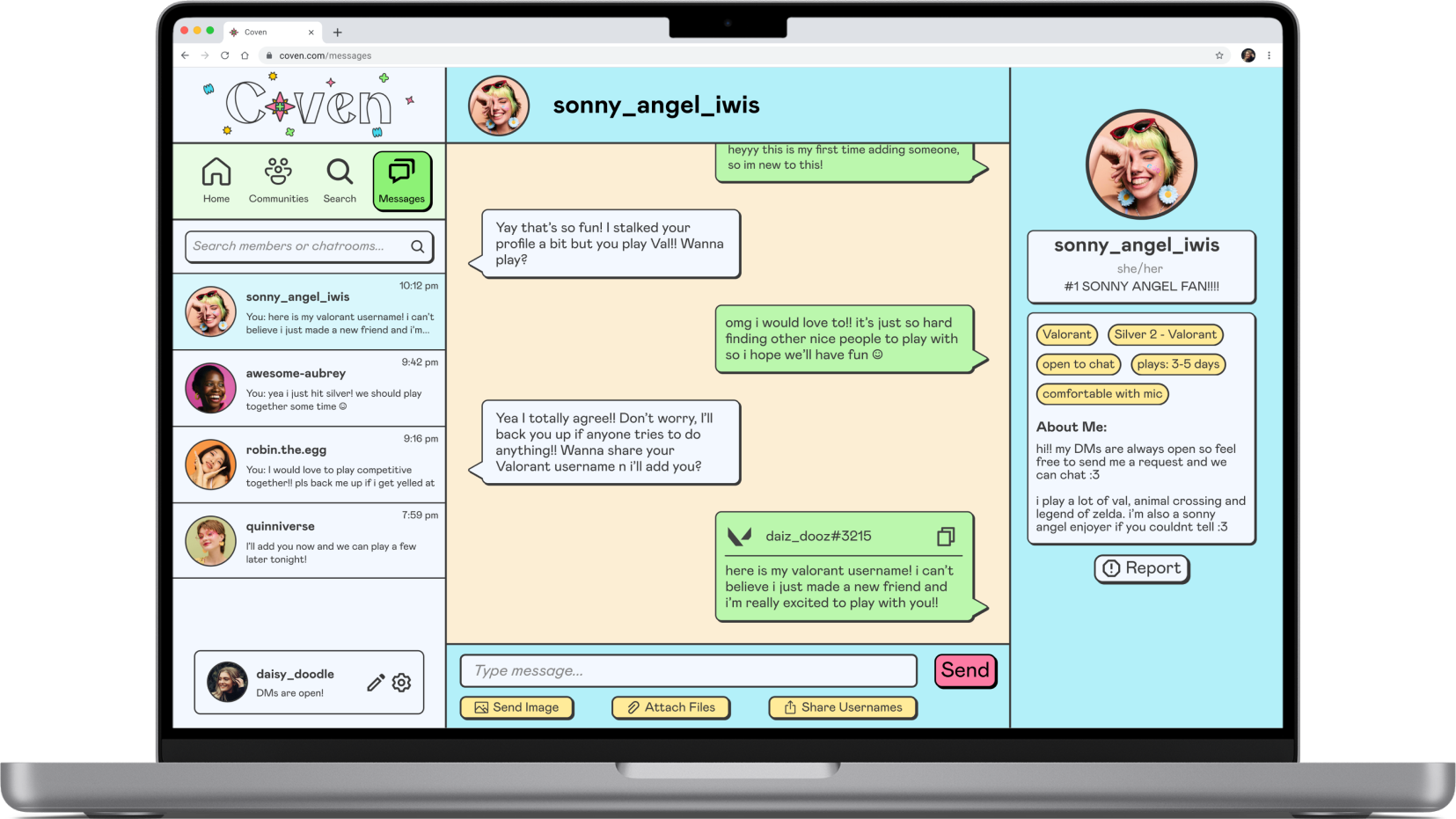
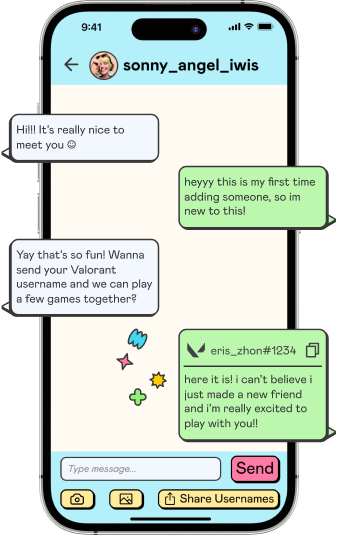
My app, Coven, is designed for female gamers to connect with other gamers and cultivate a positive environment in order to have a harassment-free gaming experience.
background
I have played video games all my life.
Most of my friends are gamers and most of them are also women. And something I would witness and experience myself is gender-based discrimination and harassment solely for existing in the same space as the harasser.
With this opportunity to create a solution for an area that I value and am passionate about? It was perfect to choose this problem space.
design thinking
My approach to problem-solving
In order to assure that I am placing the user’s needs and goals first, I followed the Human Centered Design Methodology. This methodology places the user at the heart of every single stage and because of this, the process is incredibly iterative to ensure the user’s needs are met.
secondary research
How is it affecting female gamers?
77% of women has experienced gender-based discrimination
20% of female gamers has experienced sexual harassment in the form of objectifying comments or rape threats.
59% of women hide their gender by not speaking to avoid abuse and sexism
user interviews and insights
To find dig deeper into what exactly are the target user's pain points and goals, 3 user interviews were conducted to explore the problem space. The participant criteria is as follows:
they identify as a woman
they play online competitive video games
they have experienced harassment while they were playing
After the interviews, 3 themes were created based on interview findings.

Safe Solidarity
The decision to communicate with teammates using their microphone largely depends on the existing comradery as an encouraging and supportive one where female gamers feel they will be defended, further encourages them to communicate and have fun.

Gender-Specific Presumptions
The common “girl gamer” stereotype negatively affects how female gamers are perceived as the assumptions based on the stereotype creates an environment where women are preemptively sexualized, undermined and harassed for simply participating in an recreational activity.

Preventative Feedback
In response to harassment, many female gamers will immediately mute and report the offending player as to not engage and witness their behaviour, yet some also feel this system is not effective as loopholes exist for the harasser to continue their distasteful actions.
“If I was playing with someone I knew, I would feel more confident to be able to confront them.”
“People forget that it’s a team-based game and they’re being mean to me for no reason.”
chosen theme
With this, I chose Safe Solidarity as the primary focus for my digital solution, as all interviewees expressed the need to assess team dynamics before deciding to speak or communicate in order to avoid harassment. They also emphasized the importance of playing with friends or in a supportive environment, which provides a sense of solidarity and protection. However, the concern persists that female gamers should not have to worry about being harassed by their teammates during recreational moments of relaxation and enjoyment.
design challenge
How might we encourage solidarity within online competitive games for female gamers who are prone to harassment in order to for them to feel safe and defended by their team?
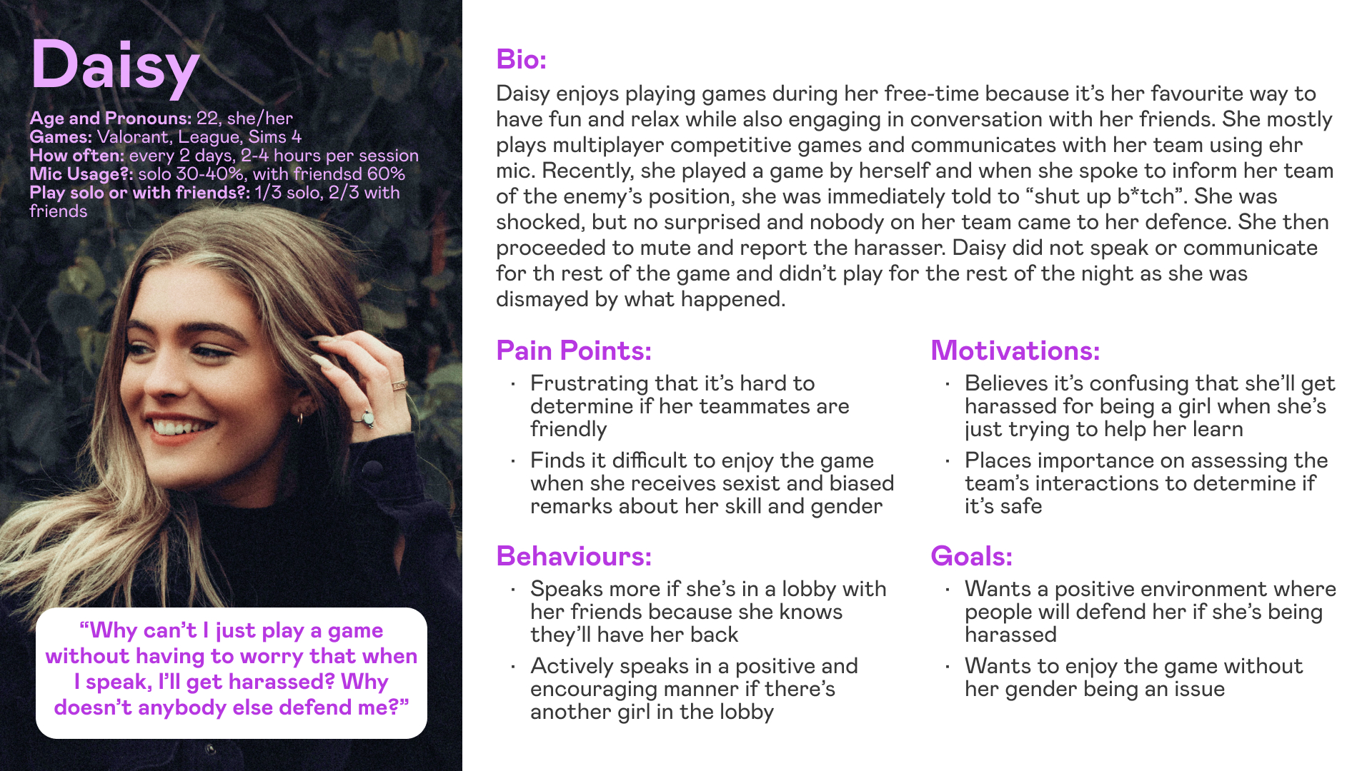
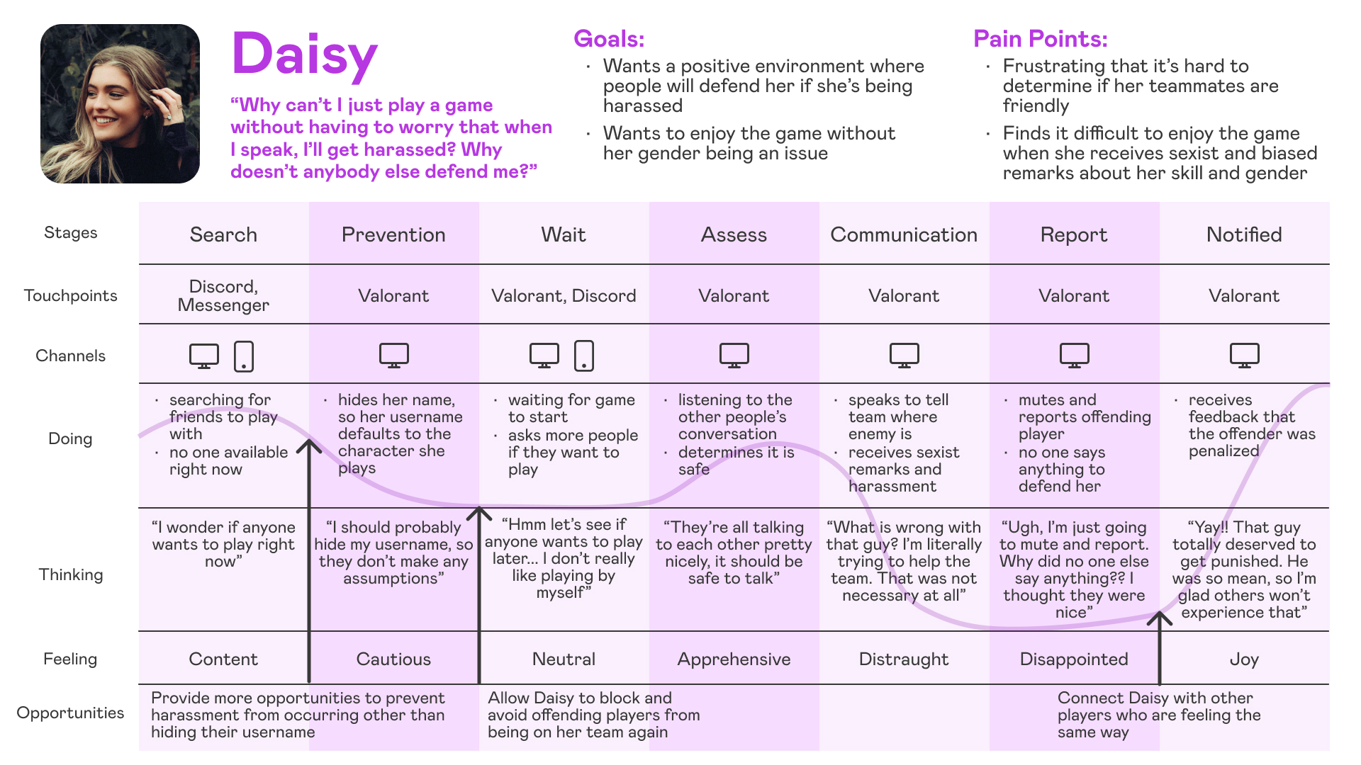
After the theme was chosen, I created a persona that encapsulates the target user in order to understand their needs, directly empathize with them and to keep the user at the center of the process. An experience map was also created in tandem to replicate a user’s unfortunate experience with harassment to better identify opportunities for improvement and remedy pain points.
With this, Daisy was created.
user stories
What would Daisy want?
Once the persona was created, user stories were crafted to guide what features should be implemented in order to fulfill Daisy’s needs and goals. A total of 21 user stories were written with 3 epics in total.
Chosen Epic: Connect with other players
As a gamer, I want to chat with nice gamers, so that I can be assured that I’m in a positive environment if I play with them.
As a gamer, I want to connect with other gamers that play the same game, so that I can make new friends and enjoy the same game together.
As a gamer, I want to join communities with other gamers, so that I can contribute to the community and feel a sense of solidarity
exclusivity considerations
Despite my secondary research and user interviews being centered around the experience of female gamers, any implemented features should not invalidate or exclude gamers of other gender identities who have experienced the same harassment.
The digital solution I create is for the purpose of finding other players in order to fulfill the goal of a harassment-free gaming experience.
This goal is not gender exclusive.
task flow
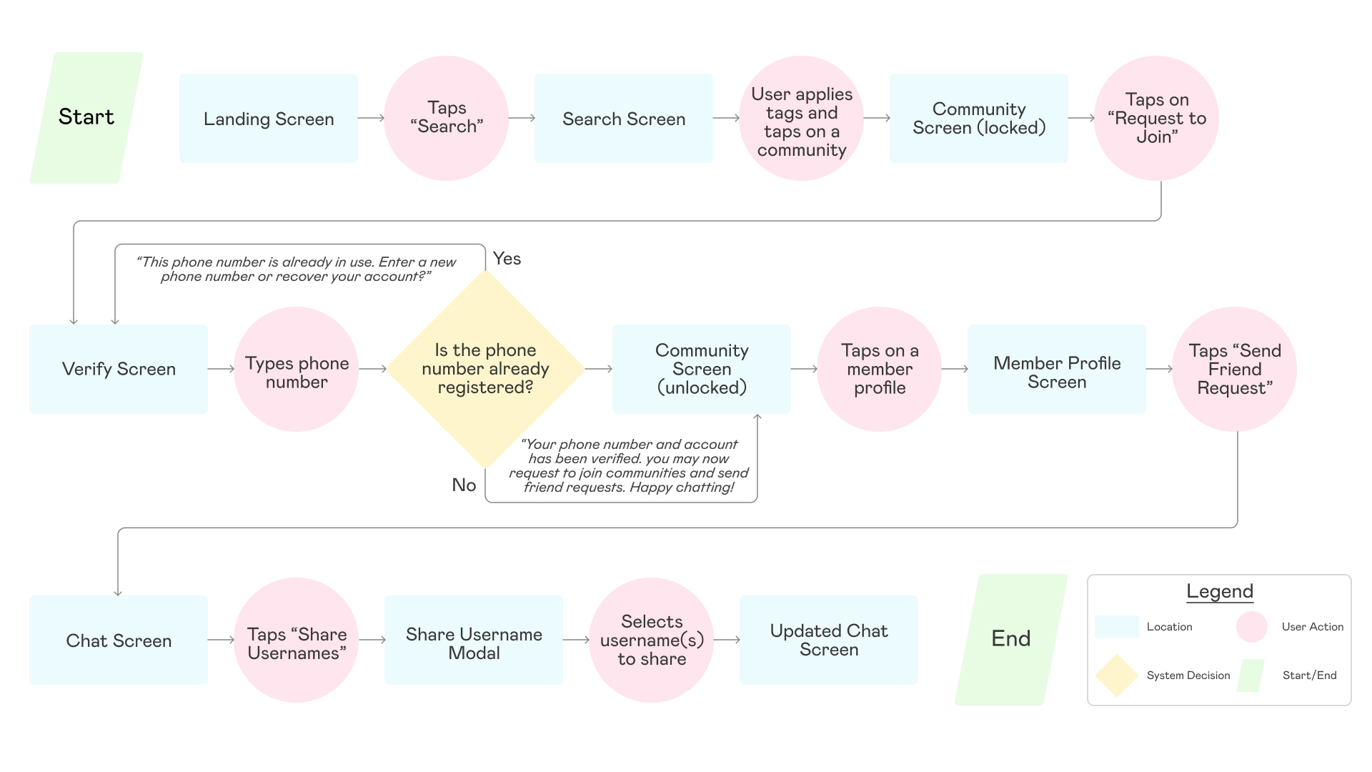
Using the chosen user stories, a task flow was created to guide the primary flow of my digital solution. It follows the user searching for a community that fits their needs and going through the verification process in order to chat with a member to start a game. This particular task flow was created because it details the steps needed in order to connect with others while keeping the user's own safety as a top priority.
sketching and wireframing
Exploratory layouts
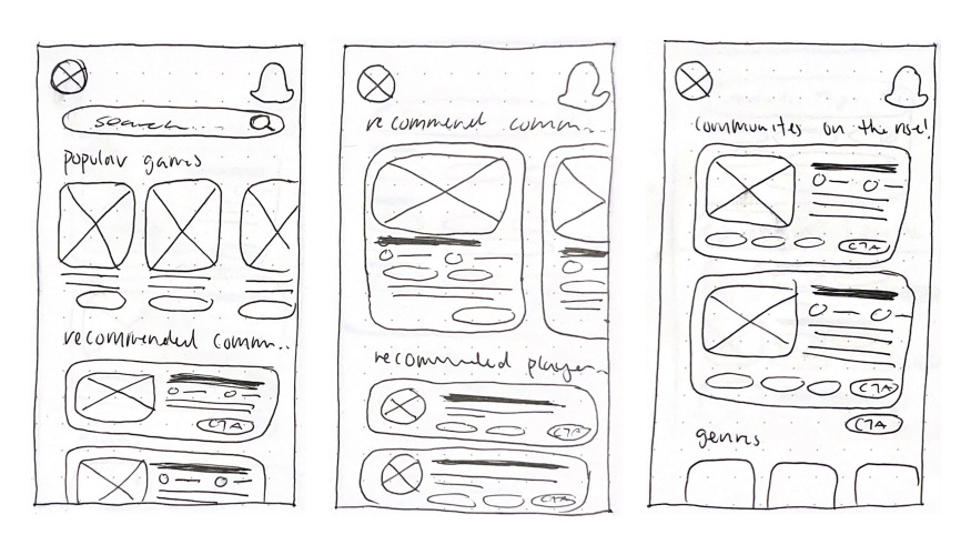
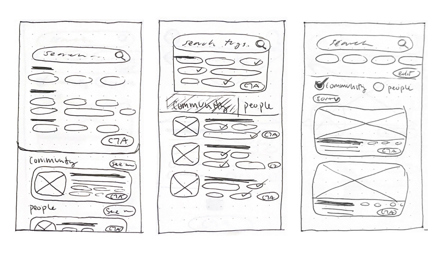
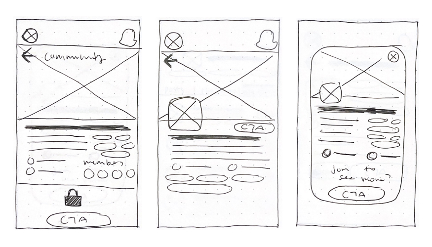
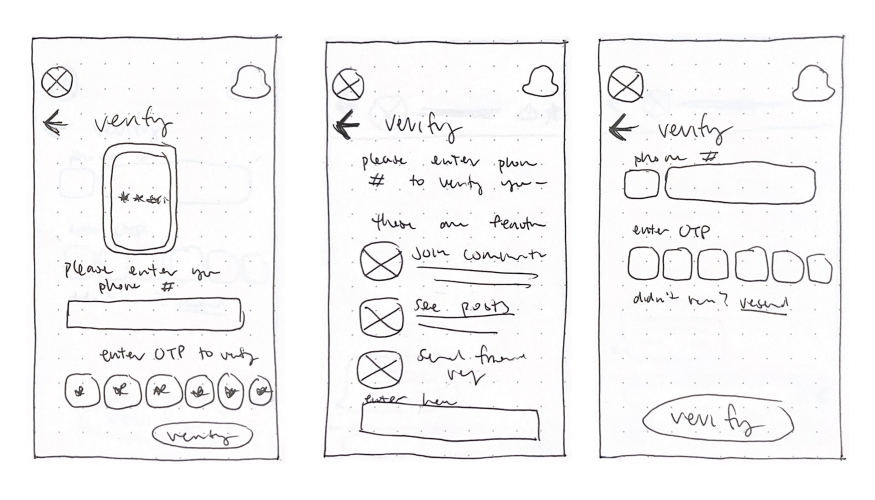
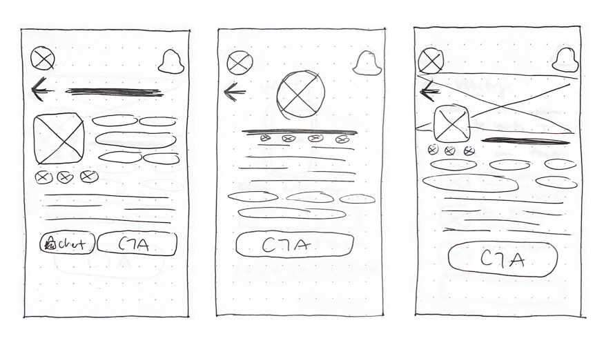
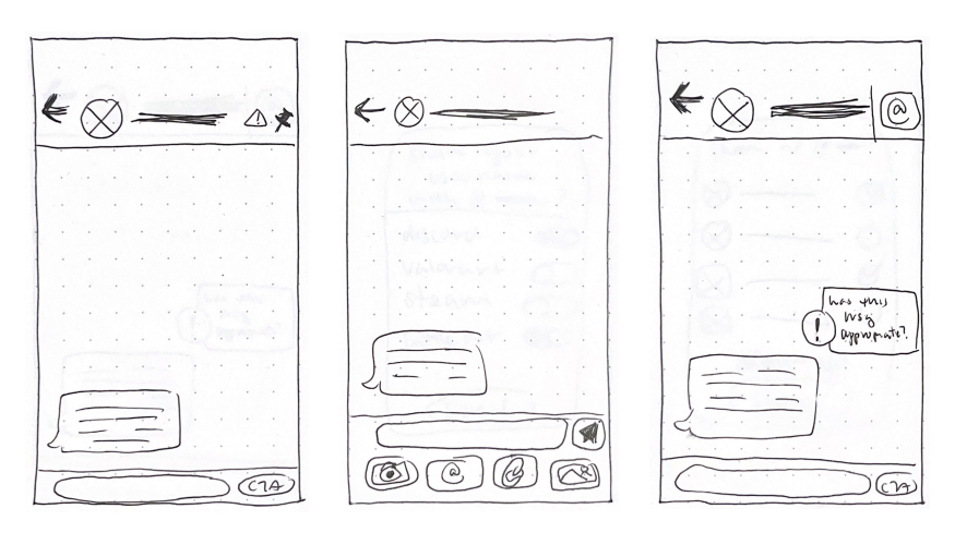
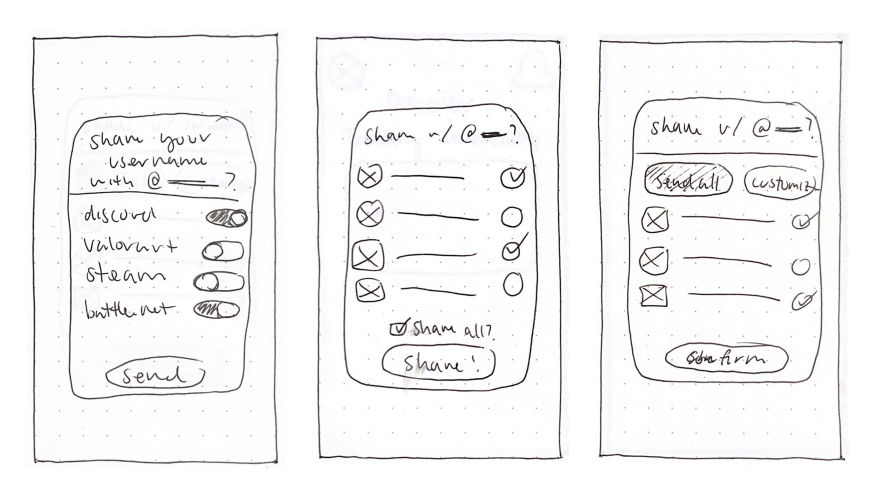
Once the task flow was finalized, I created a UI Inspiration board to assist with my ideation process and to gain insight from different layouts as I would be drawing reference from existing apps. Sketches were made on paper for each screen to explore the possible layouts and experiment with how information was laid out.
I then selected sketches with the persona’s needs and goals in mind which I then turned into greyscale wireframes on Figma. Afterwards, I prototyped the primary flow, but only used basic animations because I was more concerned about the prototype’s usability for testing rather than fidelity.


Drag to see how sketches turned into wireframes!
2 rounds of usability testing
Looking for feedback
2 rounds of user testing with 5 individuals each was conducted to test the usability of my prototype. Each tester was given 5 tasks and because I was able to watch them test my prototype in-person, I was able to see real-time reactions which allowed me to ask follow-up questions about their thought process.
Both rounds of testing revealed that there were no issues with the usability, however there was a consensus amongst both rounds in that clarity of the user’s location and unknown meaning of icons were the main issues. In addition, the second round of testers were all gamers (3 of them were the original interviewees!) and because their demographic was different, their feedback offered a unique perspective to my prototype as they are the target audience.
key findings
Landing Screen
Most users had issues with the clarity on this screen. The logos on the navigation bar were not unanimously understood, the settings and profile button are redundant and the location highlight was barely noticeable.
Share Username Button
In round 1, 2 out of 5 testers tapped on the wrong button and when asked, they said they didn’t associate the “@” symbol as usernames. Because of this, I changed the icon to the IOS share button as it would be more recognizable.
This backfired on me because in round 2, 4 out of 5 testers tapped on the message field instead. When prompted on why they tapped that text box instead, they said when they send usernames in real-life, they are used to typing it out rather than a button because a “share username” does not exist in real-life. With the combined feedback, the final share username button has every piece of information in it, so there is no confusion on its function.
revised mid-fidelity wireframes
branding
What is the essence of Coven?
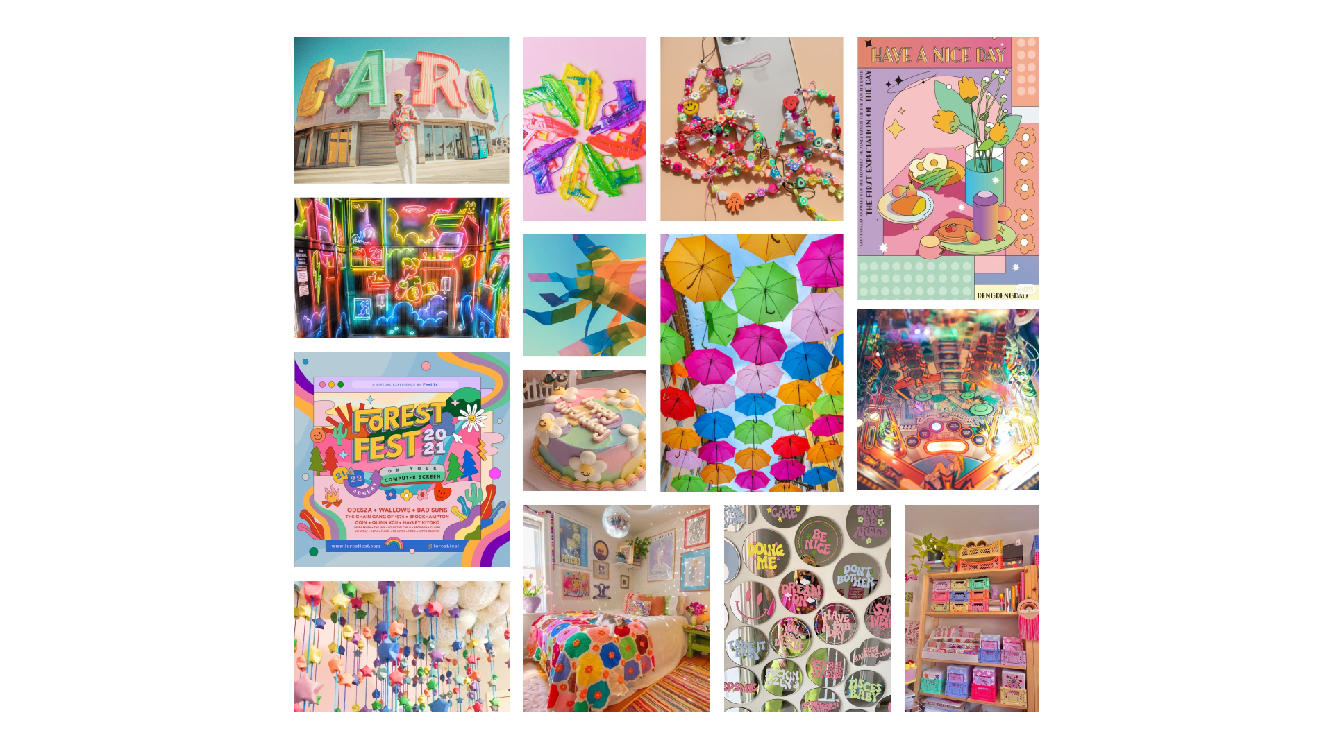
Once the revisions were finished, I began to develop my brand identity as I was translating my mid-fidelity prototype into high-fidelity. A list of adjectives that I wanted my app to embody was created so that I could refine the feeling and energy I wanted the app to exude.
Although the problem space and the original inspiration for the app is quite grim, I wanted the app to have an energetic outward expression and it was extremely important to me because users should be using the app to have fun and the branding should reflect that!
develop and enhance
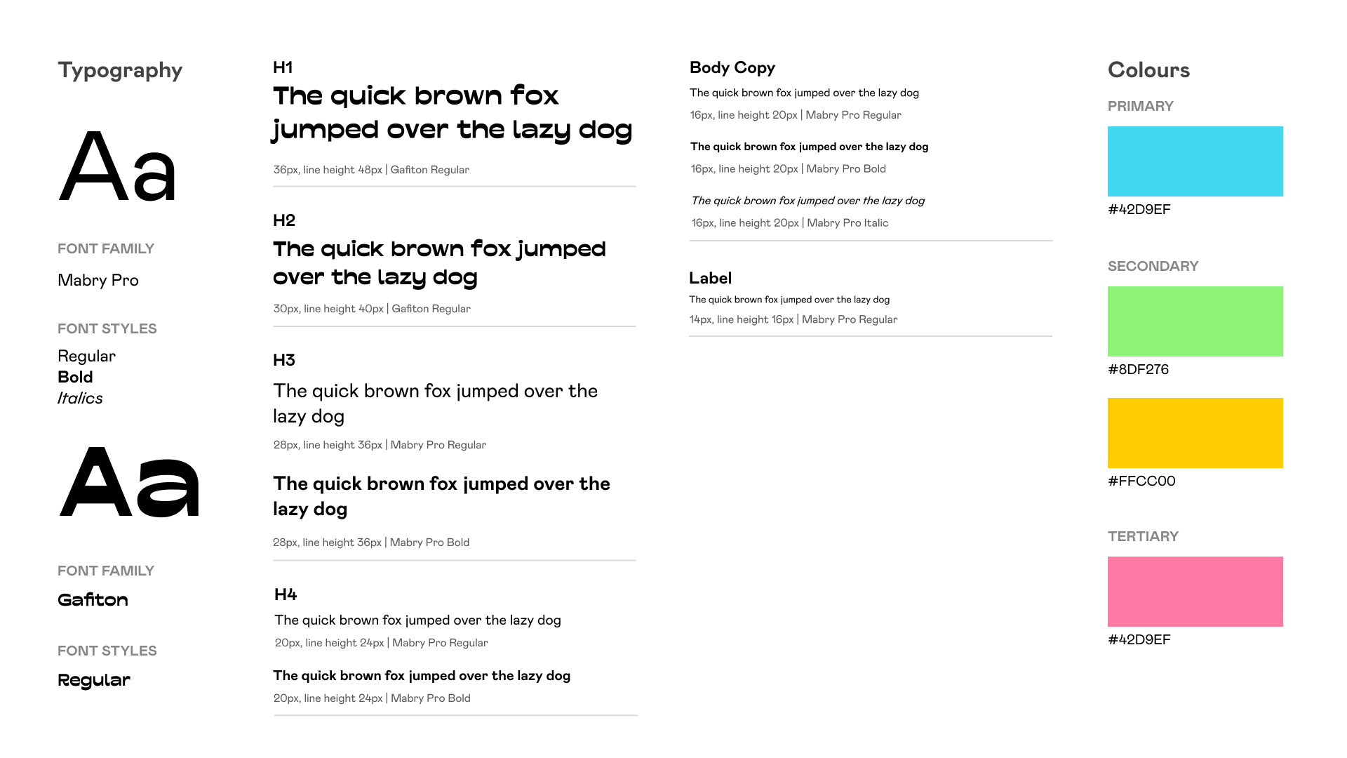
With the chosen adjectives, a moodboard was created using photographs and images that give me the same feeling. Shortly after, I also developed my brand guide including colour styles and typography based on the colour palette and aesthetic.
Further insights on the following can be found adjacent:
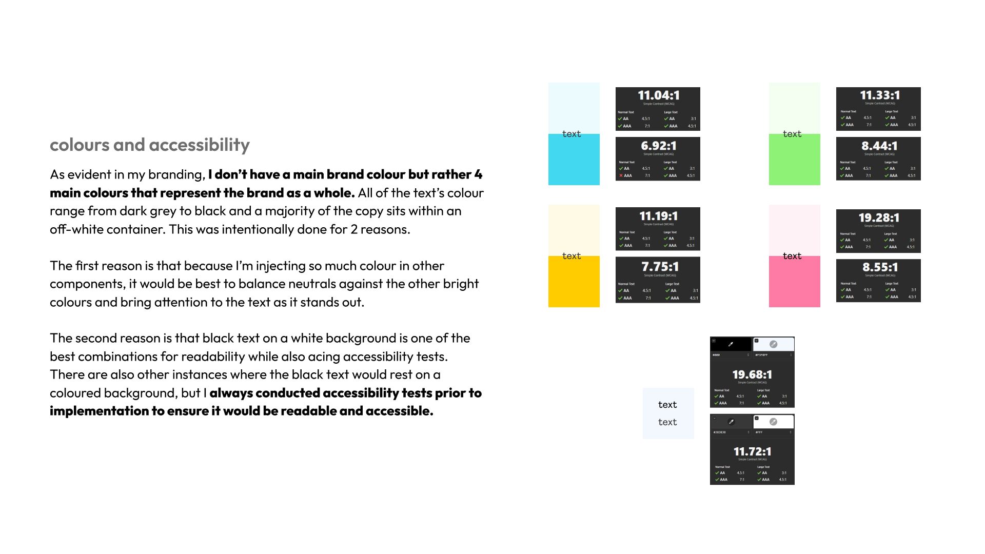
- colours and accessiblity
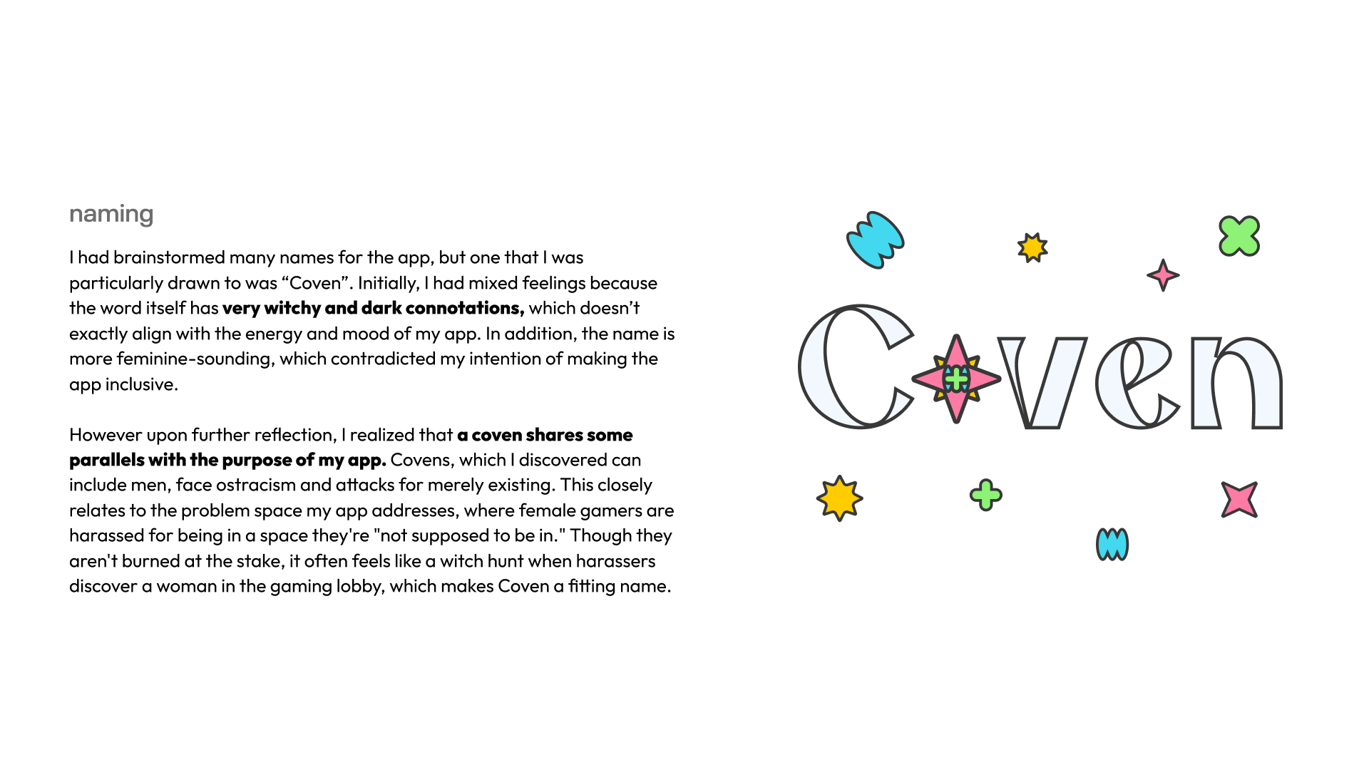
- naming
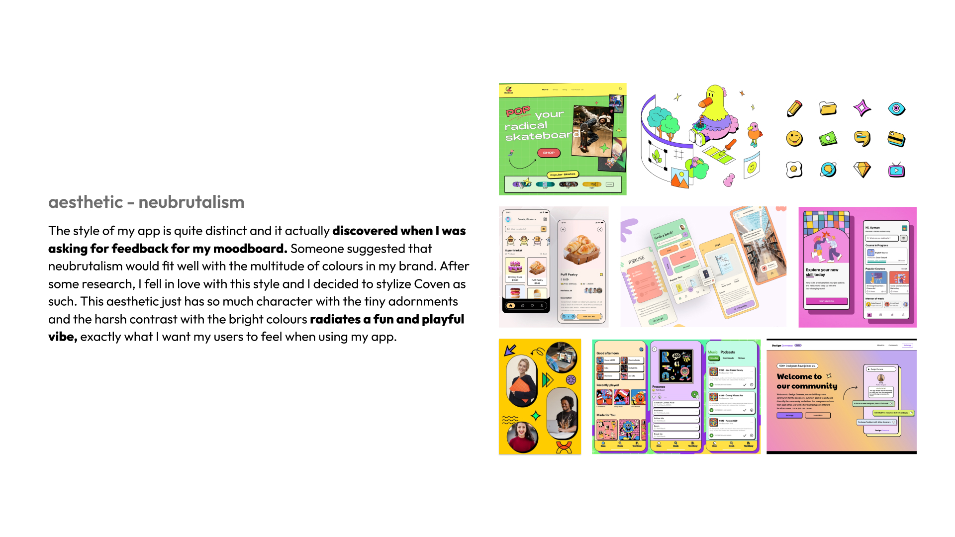
- aesthetic
high-fidelity prototype
Bringing it all together
With the branding refined and fleshed out, I was ready to inject colours and stylize the interface. I constantly referred back to my UI library which both eases designer-to-developer hand-off and for me to keep track of all my elements and its respective spacing.
marketing website
Expanding Coven's reach
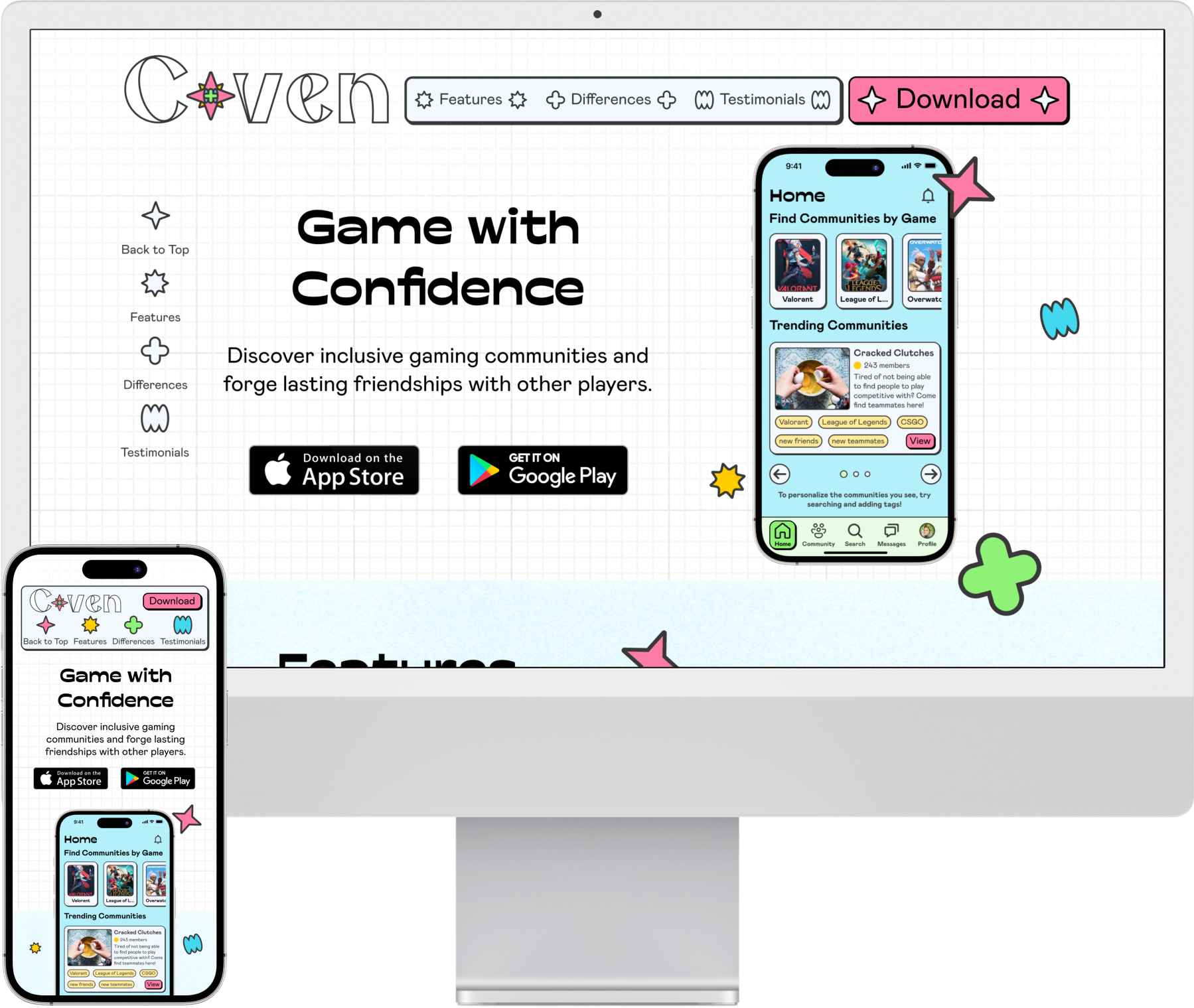
To broaden the reach of Coven in terms of reaching the target audience, I created a responsive marketing website for both desktop and mobile viewports. The site includes information about the app’s features, how it stands out and user testimonials in an effort to encourage the user to download the app.
multi-platform
Coven for desktop
To also consider different use cases of Coven, I created a desktop web application to show how the app would look and function on this new platform. Because video games are mostly played on a computer, it made the most sense to me to choose desktop as the alternative platform.
value proposition
Game with Confidence!
Just as the marketing website says, everybody deserves to game in a harassment-free environment!
Customize communities
By applying tags to both communities and members, instantly discover like-minded friends without the need for extensive messaging. Users can take control of their gaming experience by surrounding themselves with the people they truly want to be a part of, forging the ultimate gaming haven tailored to their unique preferences.
Safety is the top priority.
While embracing inclusivity for all, Coven's core philosophy revolves around prioritizing user safety above all else. Verification through phone number is required in order to interact with communities and members to foster a safe environment but to also ensure that banned toxic offenders are prevented from returning.
next steps
What's next?
As of this moment, Coven only has one task flow. But just like how the design process is iterative, there is always room for improvement and additional flows. Keeping in mind that the user’s safety is at the forefront, different ways to preserve a positive environment within Coven was considered.
Some possible flows and additional features
Report System: The report buttons are already put in place to report a community or member, but it has no functionality. I would love to flesh out the task flow for reporting someone as safety and maintaining a positive environment is integral to achieving the user’s goals.
Cross-Platform Reporting or Reviews: It was mentioned in my user interviews that gamers would like to know if a player in their lobby has been reported previously for toxicity or negative behaviour. It would be beneficial to the users on Coven if they were able to search up players as reported or reviewed by members on the app for bad behaviour so the user is informed of their teammate’s actions and would subsequently know to avoid interacting with them.
key learnings
Takeaways
Because this project spanned over 10 weeks and I was constantly learning new UX concepts every day, there were highs and lows. The biggest takeaway was that the design process is constantly iterative and the value of understanding the user.
Up until I was writing this case study, I was still making revisions even after I “finalized” the prototype! This app and its problem space is incredibly personal to me, so I wanted to refine Coven to be the best possible version it could be. However, this ended up being a challenge as I struggled with not knowing when to stop refining and moving on to the next step because I wanted it to be perfect. But through these 10 weeks, I gradually learned to embrace “better done than perfect” and getting down the main features is what’s needed because there are always opportunities to refine later.
Because I am a part of the target audience, it does not mean that my opinions and thoughts are representative of the whole. Through conducting user interviews and creating a persona, it allowed me to empathize with gamers as a collective rather than the perspective of a single user, me. This challenged the existing opinions I had for the problem space, but with the sole focus on placing the target user at the heart of the solution, I gained a new perspective that allowed me to deeply understand their needs and how to alleviate their pain points without any biases.
designed by iris zhong | last updated aug 2025
