BC SPCA
Role: UX designer
- User research, user interviews, wireframing, prototyping, usability reviews, accessibility compliance
Tools: Figma, Canva
Project Type: Donation Flow and Landing Page Redesign
Team: Jaime Cowell, Jocelyn Chan, Soroush Emami
Timeline: 1 week Design Sprint (5 days)
Designed For: Desktop
The Problem
Through our usability review, we found it difficult to navigate the existing BC SCPA website as well as secondary research paralleling our own uncertainty as to where and how donations are distributed.
The Solution
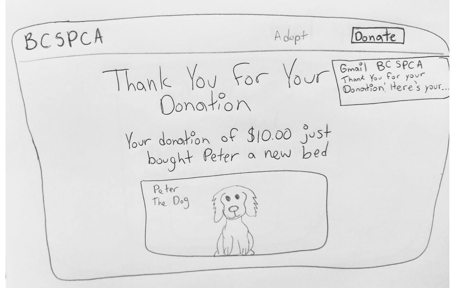
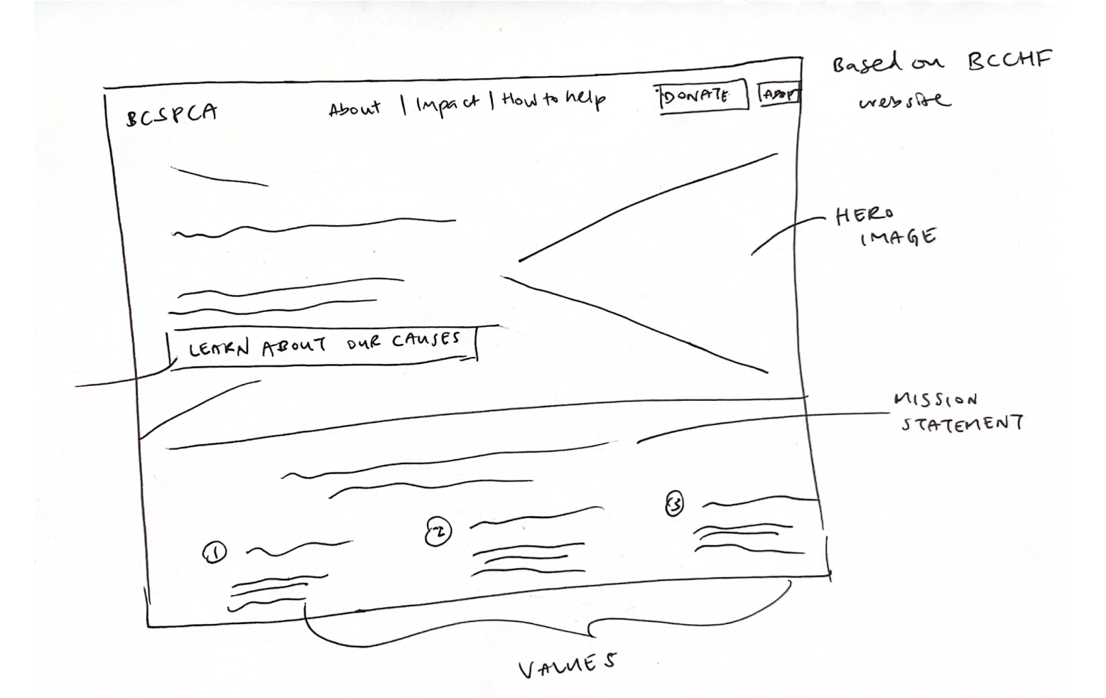
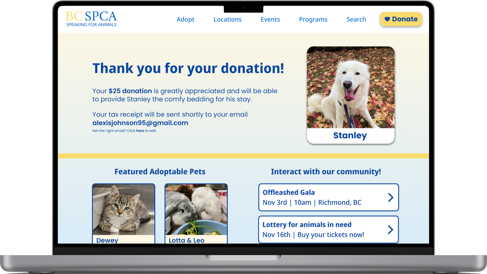
The landing page was redesigned with the intention to provide clarity and fund transparency to the user by highlighting BC SPCA’s mission statement and values. The donation flow’s UI was also redesigned and centered around the animals in need, fostering an emotion connection and an understanding of their donation’s impact.
design thinking
Our approach to problem-solving
To ensure that we were focused on the betterment of the user’s donation experience and to also convey the organization’s objective clearly, we utilized the double-diamond approach to tackle this redesign.

background
My donation experience
I currently work at BC Children’s Hospital Foundation so I have direct and relevant experience with handling donations and interacting with donors.
With my work experience, I was able to provide insight from the “back-end” in how fund designation works and how a connection is built between the cause and the donors.
problem space
Usability review
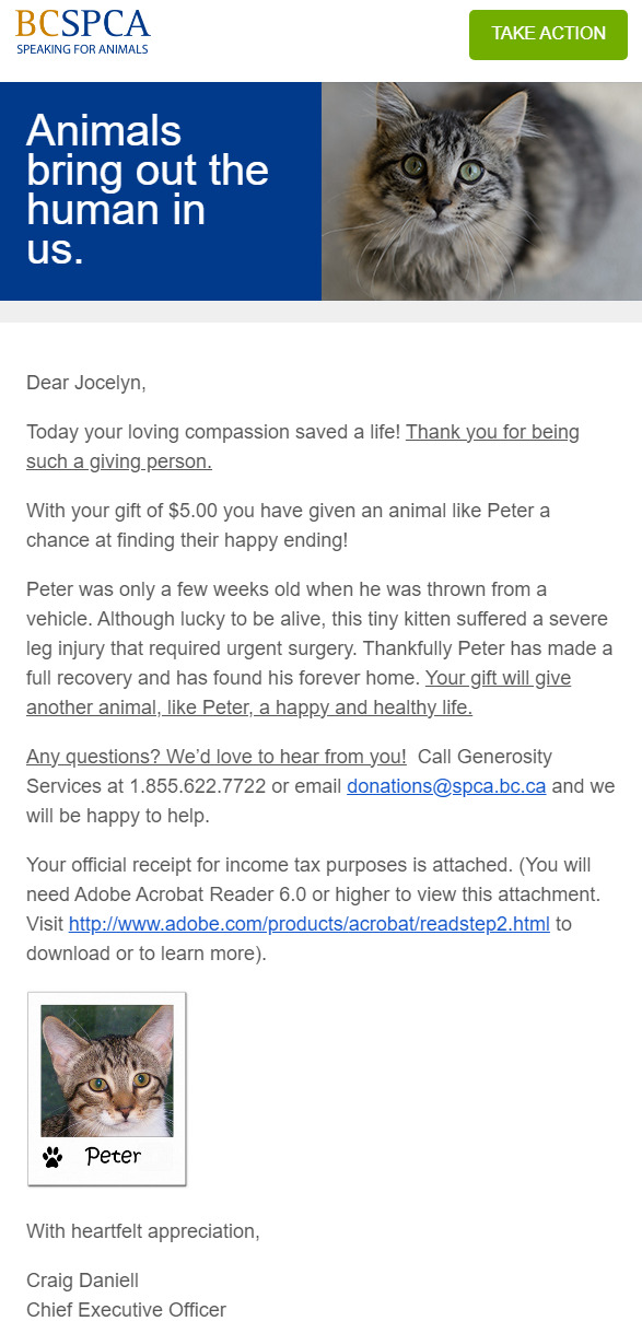
Because our prompt was to redesign the donation flow, our first step was to conduct a usability review on the existing BC SPCA website. Both Jaime and Jocelyn graciously donated multiple times so we could get an authentic glimpse of the donation process as the donors themselves.
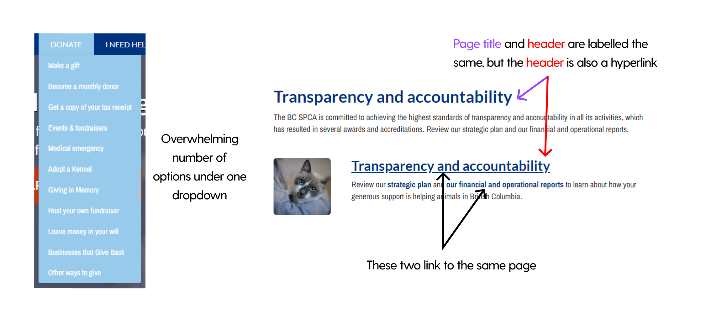
Overall, we found that their website was hard to navigate primarily due to misleading typography and a confusing information architecture, therefore we could empathize with prospective donors who are frustrated because we shared the same sentiment during the donation process and the review. Some examples are shown below:
secondary research
Do people donate and if not, why?
Millennials are the second lowest age group who are animal donors at 9%
12% of individuals state their reason for not donating is lack of trust
During our research, we mainly focused on the demographic of donors and reasons why people do or do not donate. Interestingly, we found the statistic on the right to be a very compelling pain point, albeit a small percentage, as it contradicts the good intentions of charities.
user interviews and insights
To dig deeper into the motivators for donating, pain points that cause hesitation and the importance of an emotional connection, we conducted 5 user interviews. Because of the limited time-frame and access to users, our only participant criteria was to be of the millennial generation.
After the interviews, 3 themes were created based on interview findings.

Wants Clear Information
Although most are aware of a charity’s general impact, the lack of specifics in how donations are utilized and the effort needed to find this information leads to uncertainty their donation will be used fairly, causing a roadblock in their decision to donate.

Emotional Drive
Some are inclined to donate to charities they share a connection with as it bridges a commonality that motivates them to give, whereas others are internally motivated from the sense of fulfillment derived from the act and by extension, the inherent value of donating itself.

Reminded by Prompts
In terms of when the act of donating occurs, most do not proactively donate or search for charitable causes, but external prompts from others serve as a reminder to give.
"I don't have the proper information or resources to know how my donation will be used to help."
"I don't want it going to a crook. I want to know exactly what's happening with my money."
chosen theme
With this, we all agreed to focus our solution around the theme of Wanting Clear Information as it had the most pain points, relates to our secondary research and reflects our findings from the usability review.

design challenge
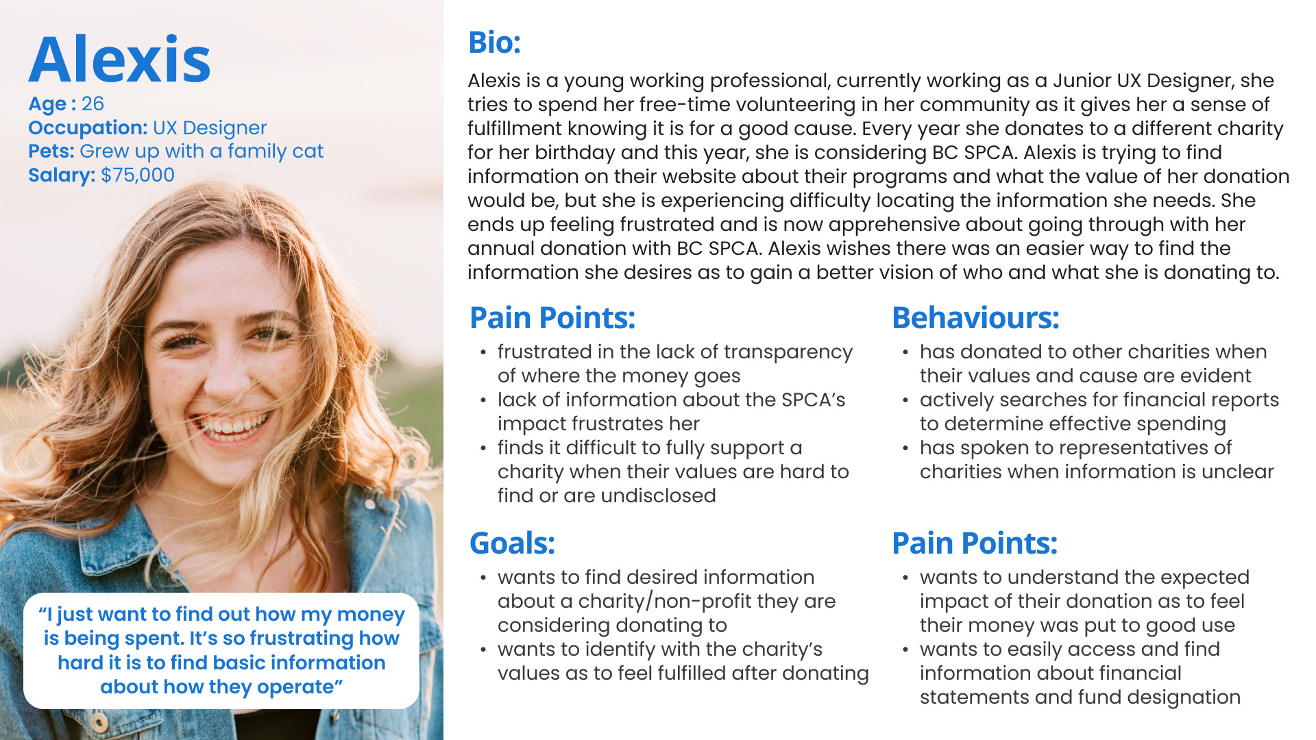
How might we better communicate the impact of donations to prospective millennial donors in order for them to feel confident in their decision to support BC SPCA?
task flow
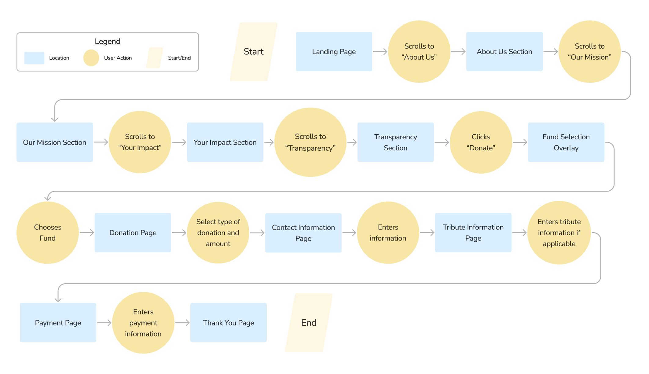
After our design question and persona was established, we drafted up a quick task flow to guide the donor’s journey while keeping in mind the key points of desired information. We were also able to understand where key points of requested information could be best implemented within the donation process, especially regarding the charity’s values and the donor’s impact.
sketching and wireframing
Inspiration and layouts
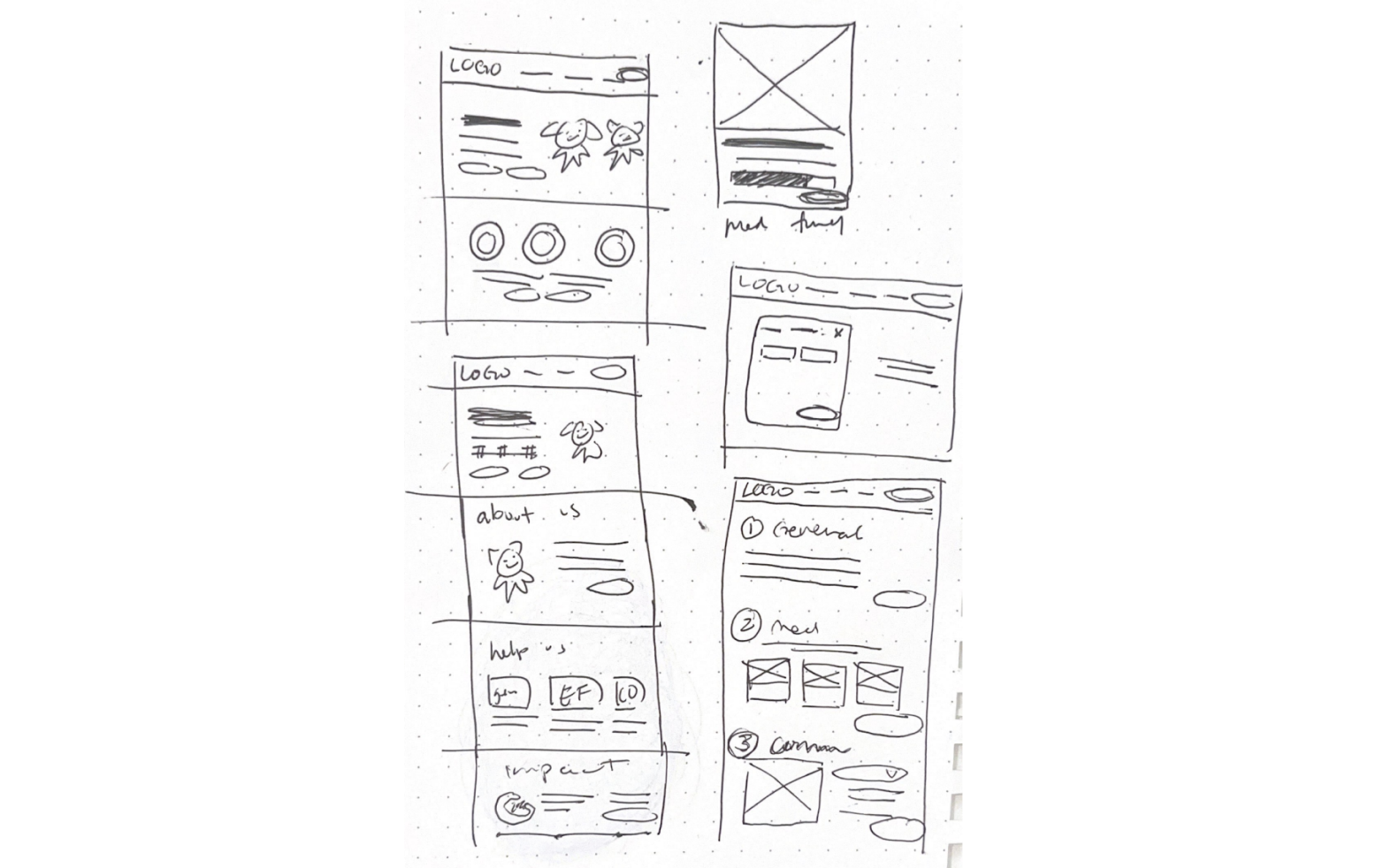
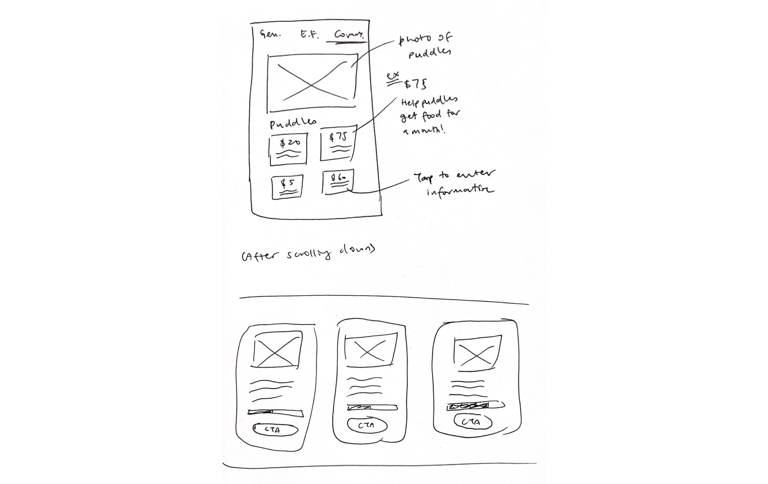
UI inspiration was gathered from charities of all industries to assist in our ideation process and also insight of different layouts. From there, sketches were drawn by all team members in which the final layouts were voted and discussed upon, to ensure everyone’s opinions were included and valued while also keeping our persona’s goals and needs in mind.
exploratory sketches
design decisions
We realized that rather that we place the desired information everywhere, as the pain point dictates, we could instill confidence in the donor throughout the donation process by designing around it. The 2 key types of information being the charity's values and the donation's impact.
- The charity's values are emphasized on the landing page as it would be first thing the donor reads and scrolls through, providing clarity and insight to their mission.
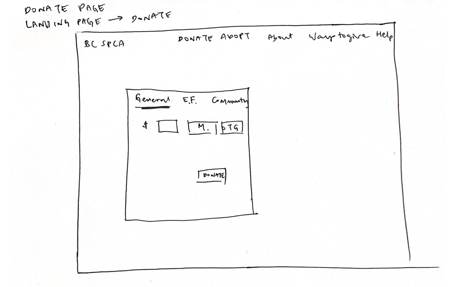
- The donation's impact is highlighted when the donor chooses the donation type and also during the donation process with clear description of the donation's utilization, thus fostering transparency.
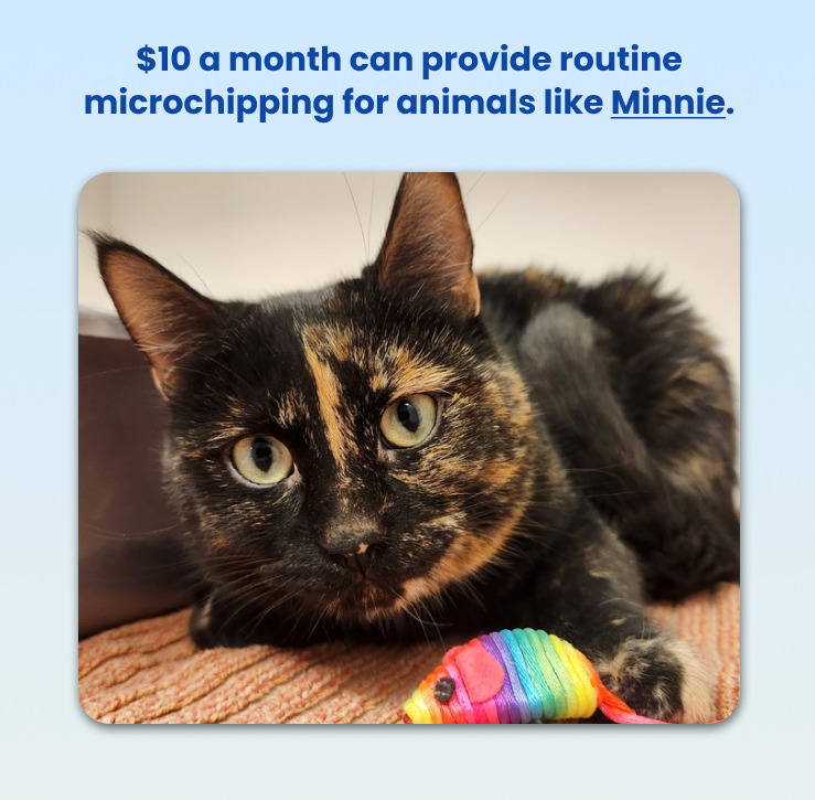
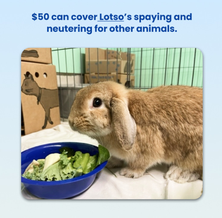
For example: We used pictures of adoptable animals from their site and added their names with personalized appeals to show potential donors who they're helping and how impactful their donation can be!

2 rounds of usability testing
Looking for feedback
5 rounds of user testing was conducted to test the usability of our prototype. Each tester was given 5 tasks, each reflecting a need or goal of our persona.
Our testing was successful and no usability issues were identified, however follow-up questions and verbal feedback indicated inconsistencies in typography and some problems with visual clarity. With our tight schedule, we gathered all the feedback and plotted them on a design prioritization matrix to ascertain which adjustments could be feasible within our scope.
key findings
Spacing and Scannability
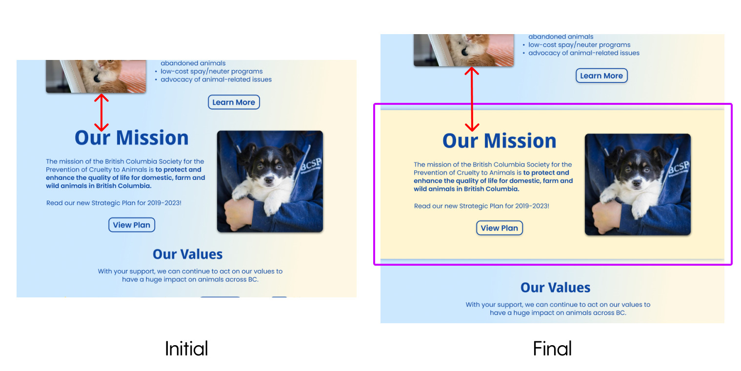
Some users noted that although the information on the landing screen was necessary, the landing page was hard to visually scan. With this feedback, we fixed this by increasing the spacing between sections and adding alternating coloured banners to keep each area of information separate.
Call to Donate
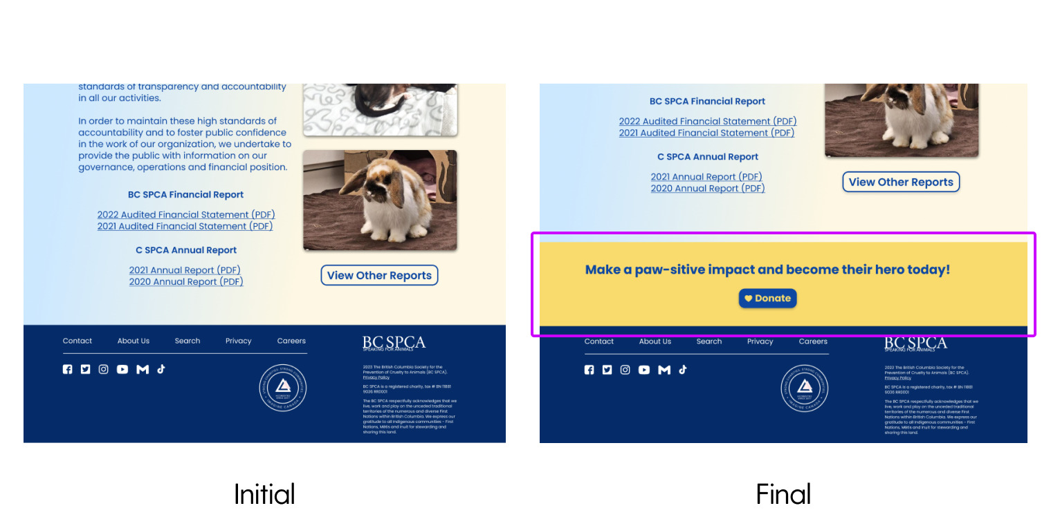
Several users also mentioned that it would be nice to have another method to get to the donation screen other than the navigation bar. We decided to add another donation button at the bottom of the landing page as it would serve as a conveniently placed reminder for donors after they finish reading and scrolling.
next steps
What's next?
As of this moment, our prototype only has one task flow and two pages. But just like how the design process is iterative, there is always room for improvement and additional flows.
Some possible considerations:
- Full Development: We considered bringing on a web developer in the future to fully code the prototype into a functioning website! Even though this was a speculative project, never did we think speculative improvements could not be implemented! We even contemplated bringing our project to BC SPCA to see what they think!
- Reorganize Information Architecture: In the original usability review, the confusing typography and complex information architecture proved to be an issue, therefore we all thought a reorganization in information would be beneficial.
key learnings
Takeaways
This project was an amazing one to work on as a group and even with the time limit! Because this project was pretty early into the program, we had a lot of ups and downs. With this, we all agreed the biggest takeaway was the importance of working as a team to stay on track.
Time management is critical and working on a design sprint timeline makes this all the more crucial. In tandem with working in a group, we communicated with each other regarding how work should be split and its "due date", which proved to be beneficial! But as always, the inner perfectionist comes out and tasks take longer because we want the product to be at its best. Learning to scale back and focusing on completing the tasks within our limited time was the biggest lesson we learnt and will value in our busy lives.
designed by iris zhong | last updated jan 2024

